CLOSER THAN THEY APPEAR
Digital property branding for Al Jazeera Digital
Project Scope
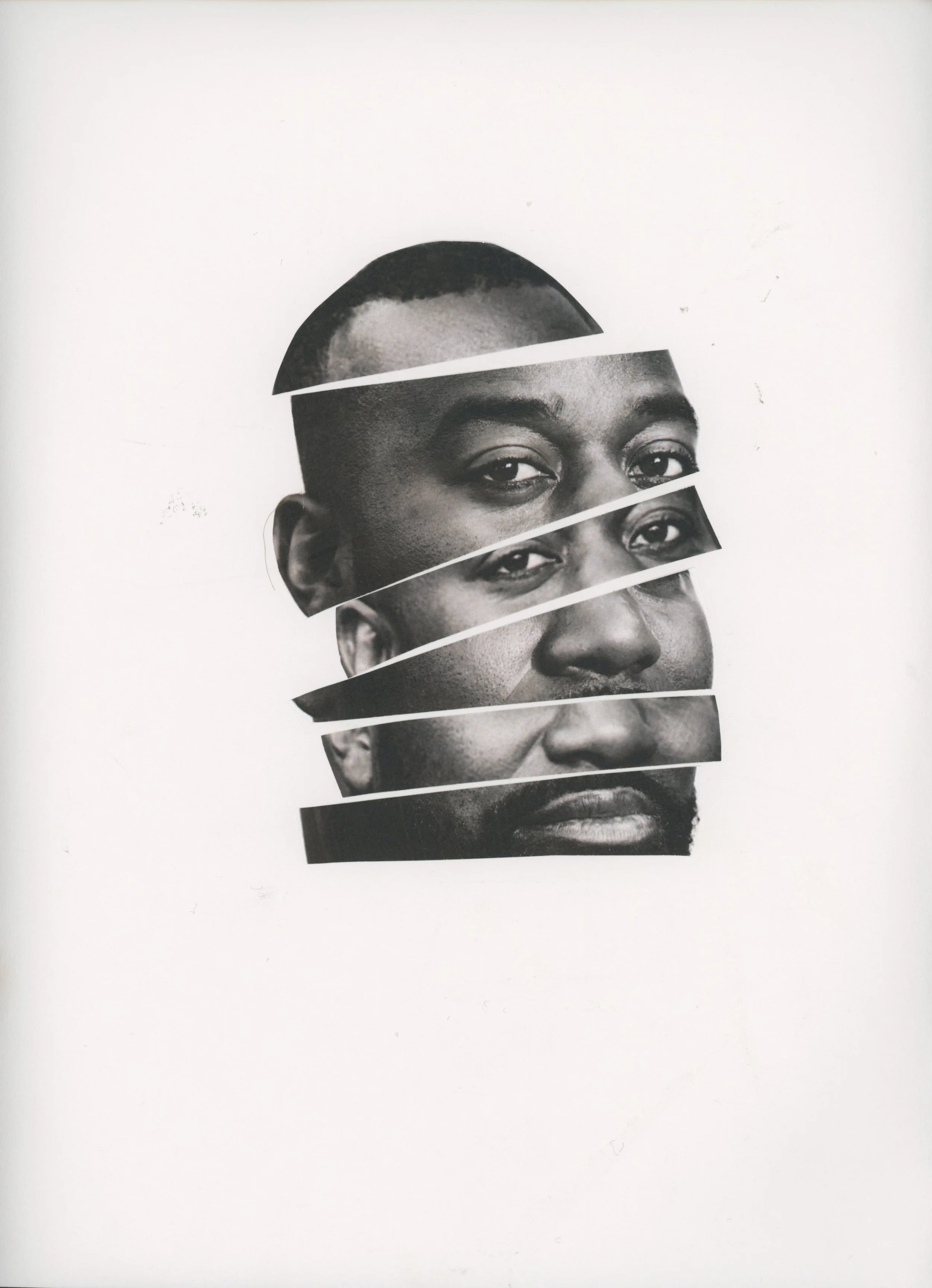
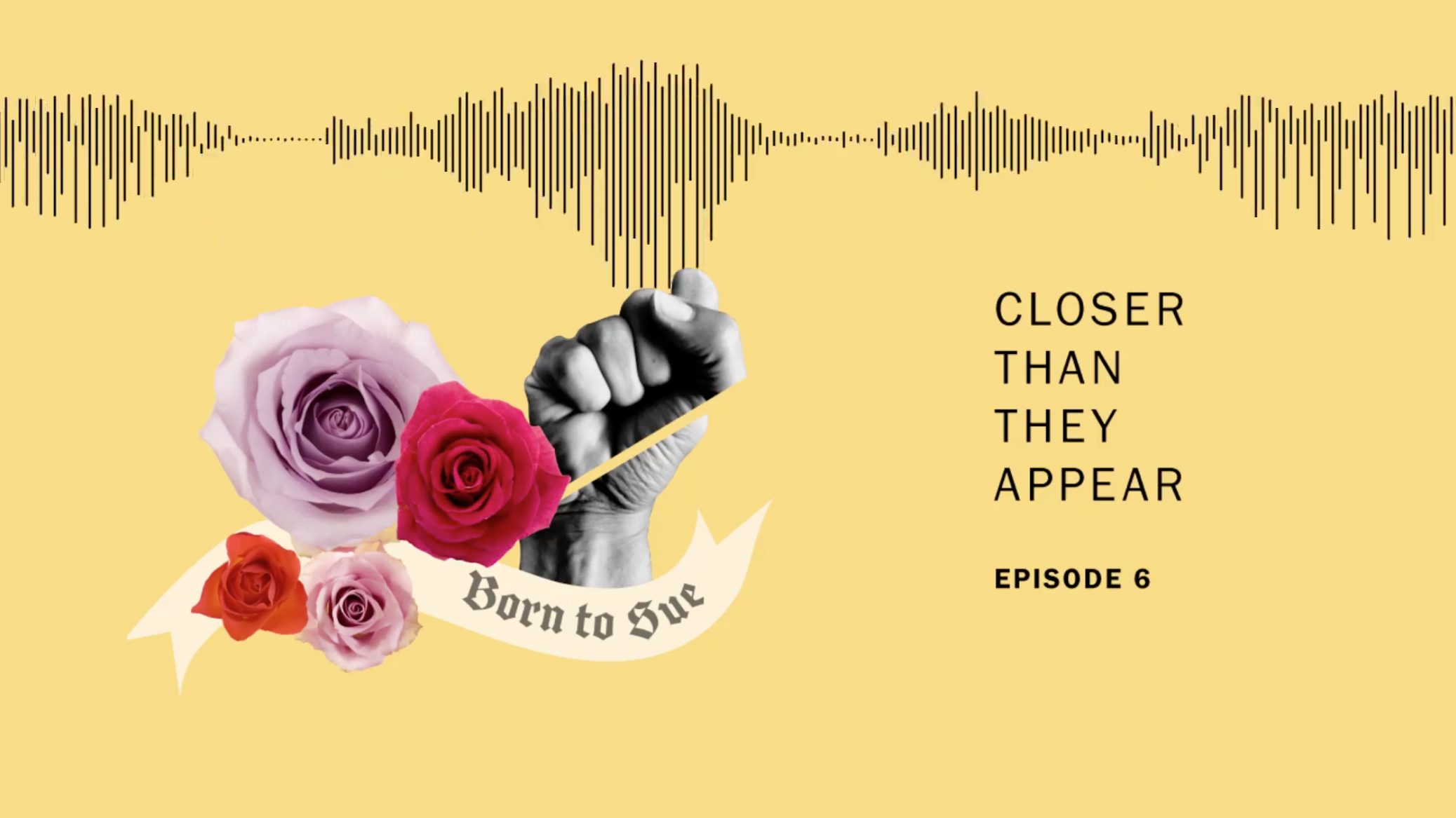
Art direction and design for Jetty's premier podcast, Closer Than They Appear - a show that examines race in America, paralleling conversations about our current political moment with anecdotes from the host's fractured past. As the creative lead, I designed the iTunes placard artwork, weekly episode-specific illustrations and audiograms, and provided art direction for accompanying animated content. These graphic assets were published in the iTunes store and across on all social media channels.
Process
After several rounds of exploration and conversations with the show producers, we settled on a direction that visualized the idea of fractured pieces coming together to form a new whole; specifically, the host's own fractured past being reconciled through his experience of making this show. As we understood another key aspect of the show to be the juxtaposition between the historical and modern, the next challenge became how to bring a contemporary feel to the overall aesthetics, and how to maintain legibility at a small scale.
The next phase of development involved experimenting with analog collage and testing numerous compositions and color combinations in podcast promotional spaces.
Expanding the System
The show branding extended beyond the cover artwork and into all of visual assets related to audience engagement and marketing. This included weekly designs which employed the same formal strategies as the cover artwork but visualized episode specific content, website graphics, and art direction for promotional animation content.


